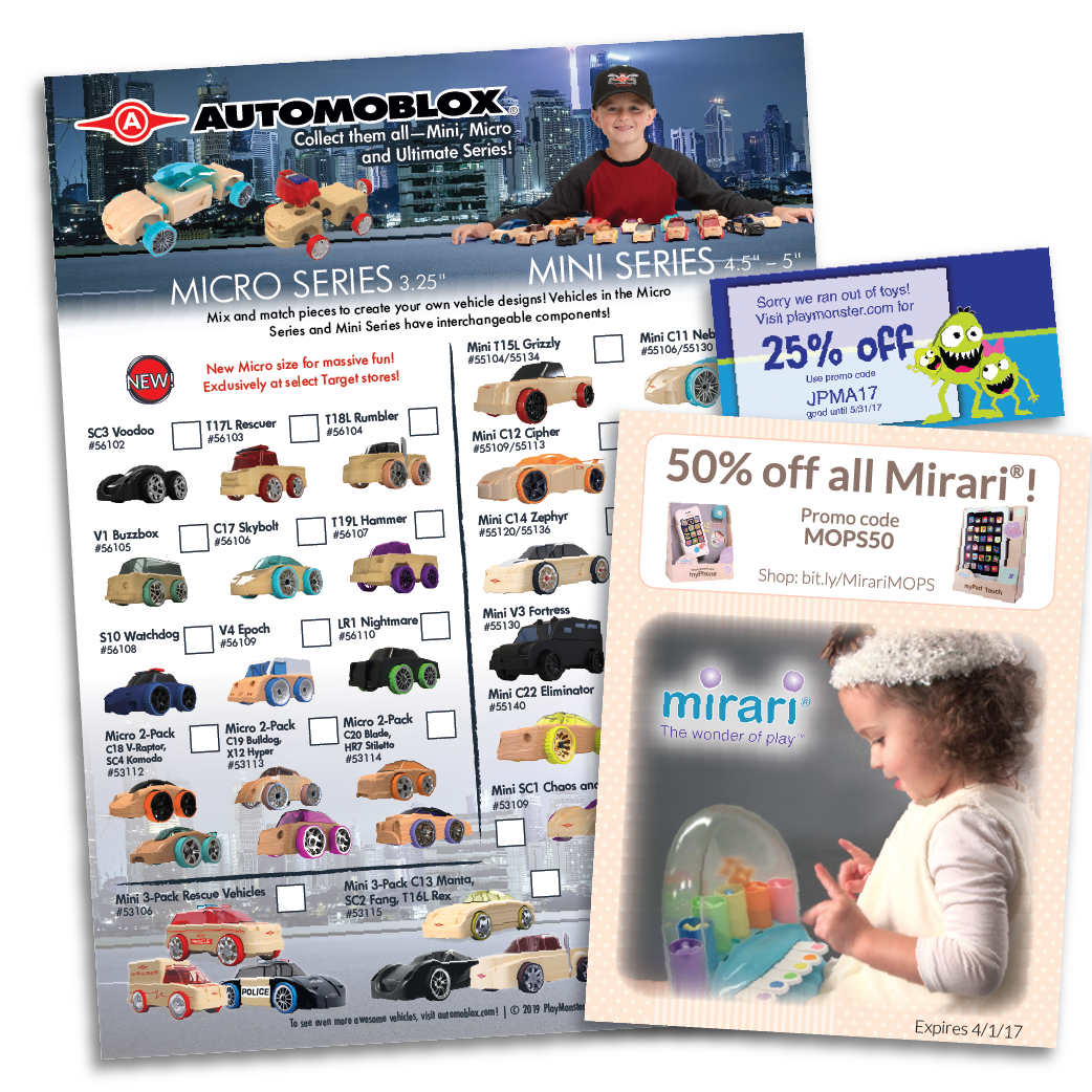
Catalogs
From Cover
to Cover
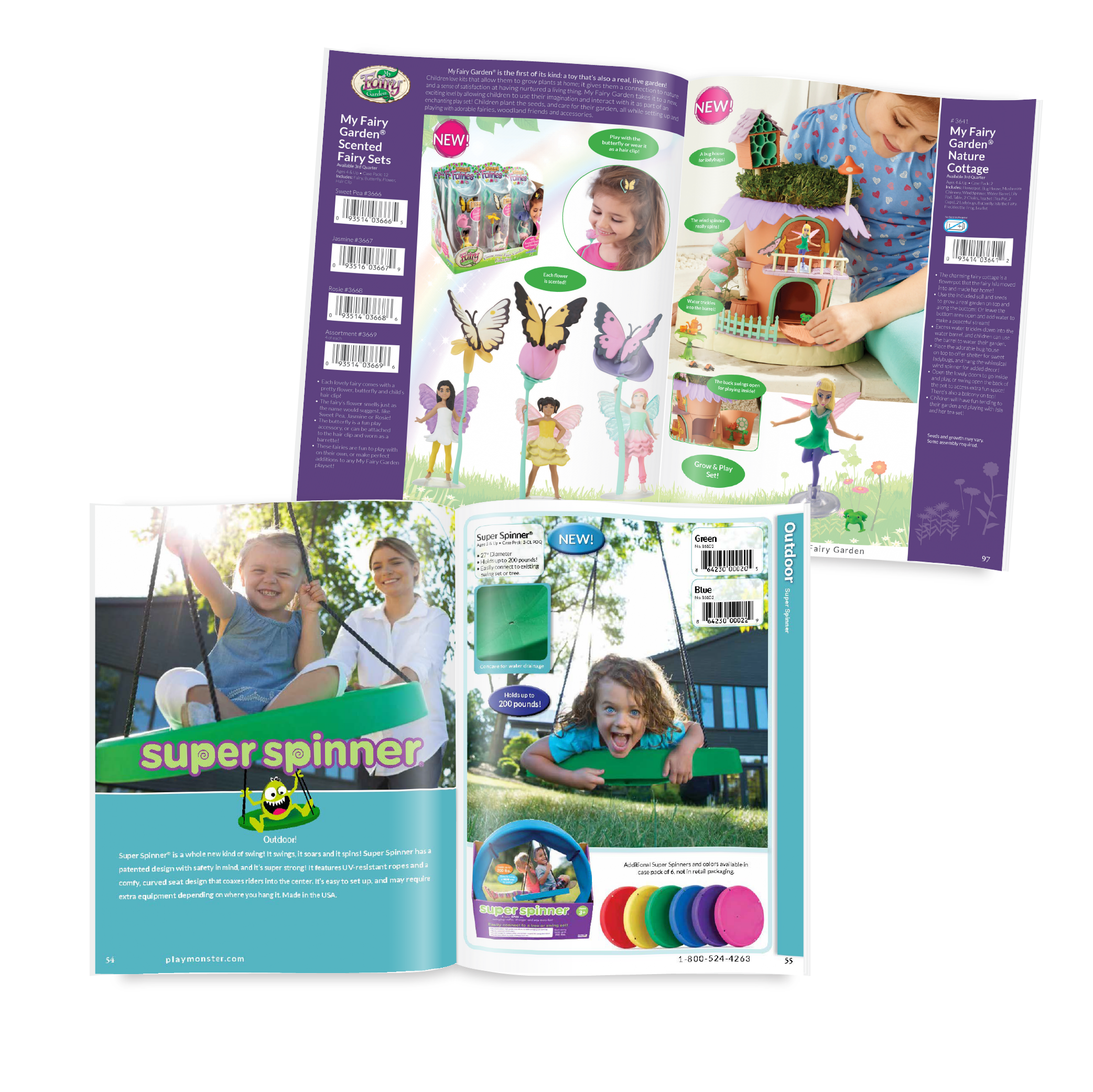
I have produced a number of catalogs over the years, including the last 6 annual catalogs for a toy and game company. This has included cover design, layout design, indexing, and tables of contents.
2019
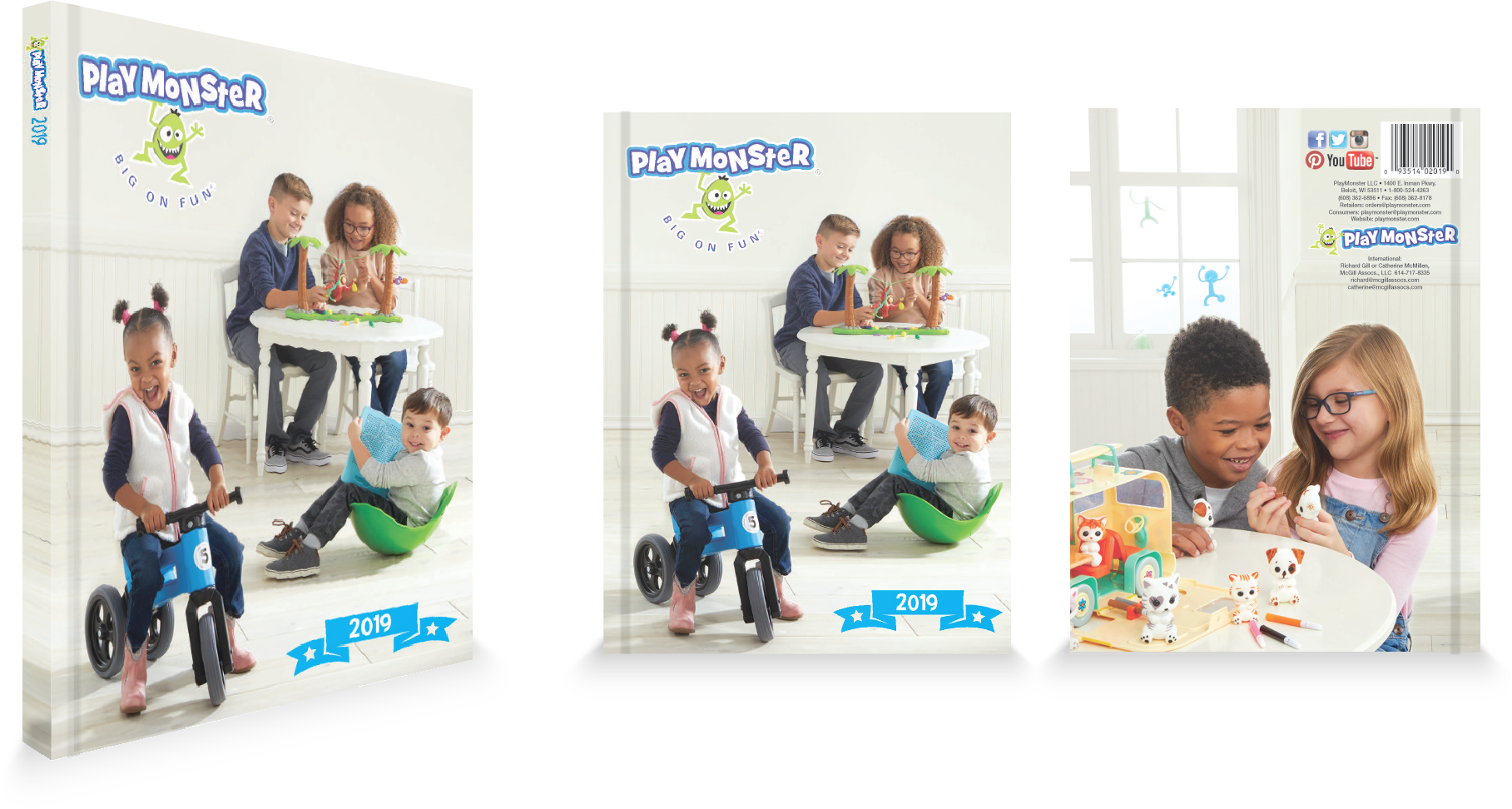
Fun for All
Another team member and I directed a photoshoot for the cover. We picked out outfits, auditioned kids, chose and assembled the products used in the shoot, selected the perfect photographer and managed the shoot. From there we reviewed hundreds of photos to select the six images used for the cover, touched them up, and then edited the photos together into the final cover. We also changed the interior layout based on interviews with the people who most frequently use the catalog: sales staff, reps, and buyers. These discussions led me to a new layout where the item name and number, barcode, and availability were on the outside of each page. This allows easy, quick access to the most important information for sales staff and buyers as they quickly flip through the catalog.
2020
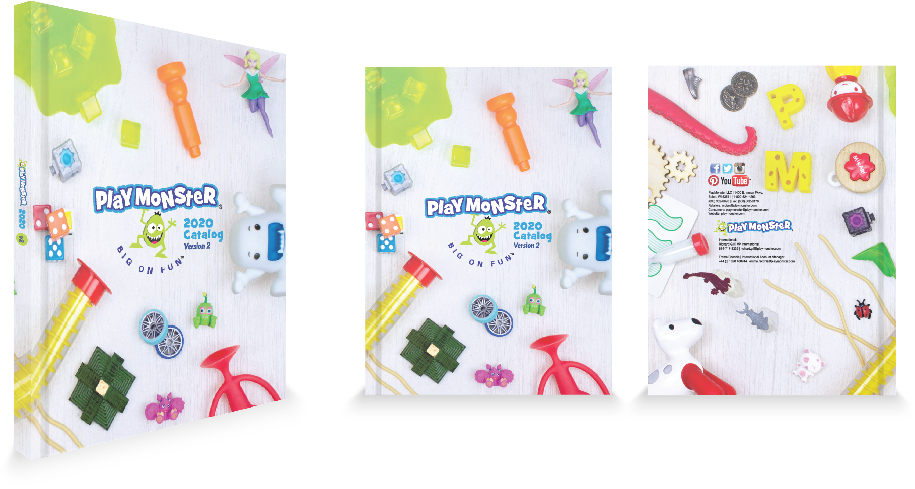
A Menagerie of Fun!
A constant struggle for any designer at PlayMonster was that managers and sales wanted to show everything all the time, but there are MANY products with clashing branding and target markets. The solution for our 2020 catalog was the concept of a child’s floor – where you could expect to see many different toys and games without any sort of packaging or brand organization. This allowed us to show many different products in a single cover to meet the needs of the sales and marketing teams, while also conveying the subtle message that the toys and games are durable and that kids and families actually play with them!
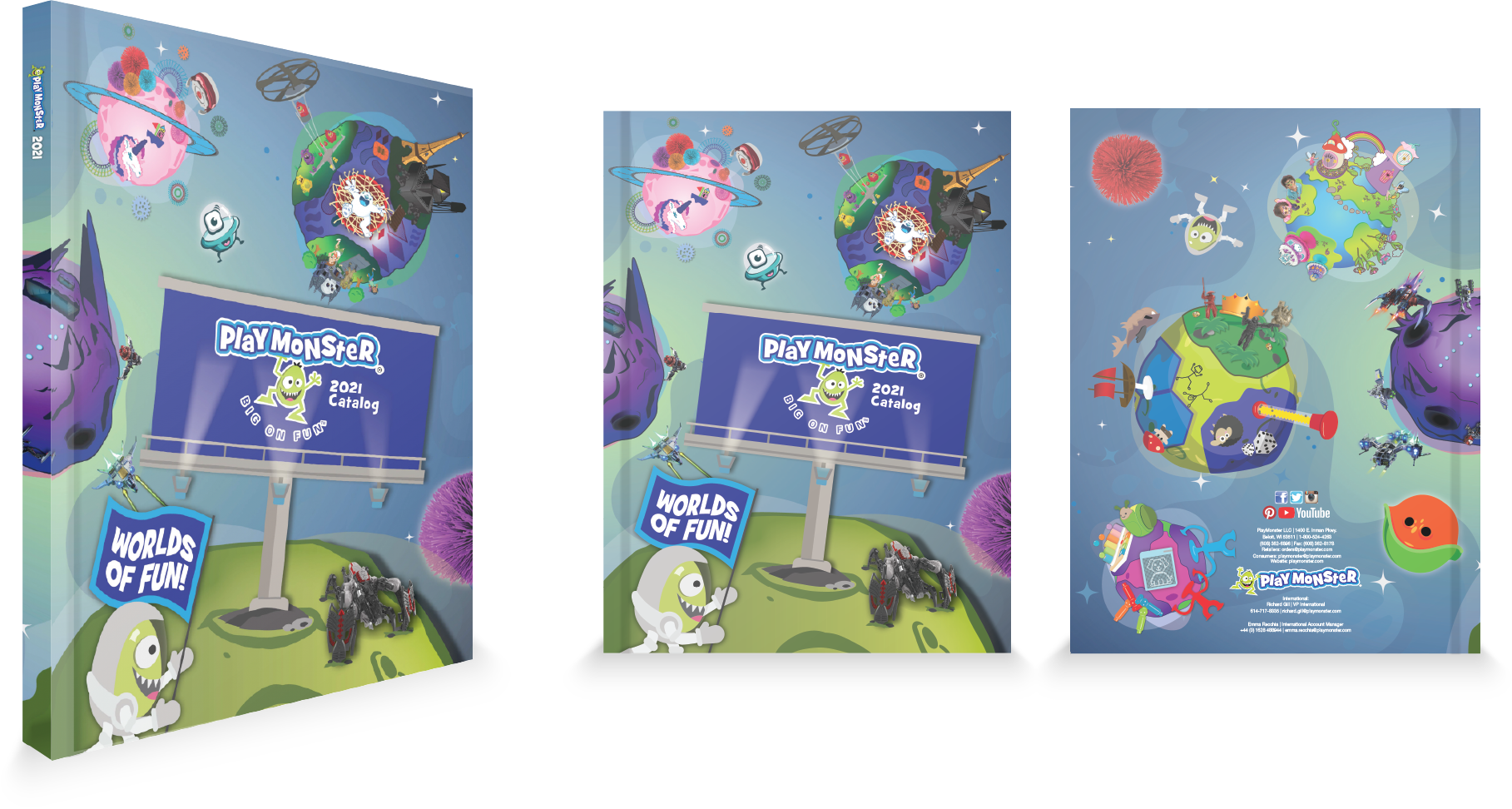
2021
Worlds of Fun!
With COVID taking hold when this catalog came out, our design team had to come up with something fun and playful while also showing the company’s serious commitment to creating cool and innovative toys, games, and products. This year’s cover design was a team effort, with a group of four designers working together to plan and create an especially complex cover. We chose an “out of this world” theme for two reasons. First, our marketing research showed a significant desire for escapism in the market during COVID lockdowns. Second, PlayMonster had developed a number of innovative STEM-focused products, so the space theme reflected this new company focus. After several years of advocating for using the catalog design as our yearlong branding theme, this was the first year that PlayMonster put the plan into action. The “out of this world” theme was carried across our branding for the entire year.
technical catalog
TOLTEC
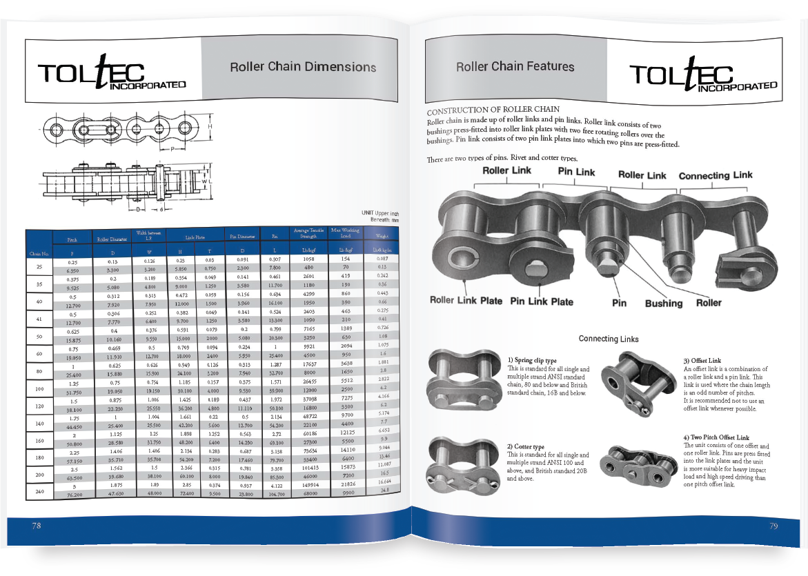
While I have a lot of experience creating fun and visually interesting designs, I’ve also worked on catalogs that have large amounts of data and need to be laid out to be easy to read. This also requires extensive attention to detail and accuracy to ensure that the information remains 100% correct in the transfer between factory data to catalog layout.

Portfolio
Related Work
Technical Docs
Print Work
Flyers and Coupons
Print Work
